Master’s Research Project • Interactive Design & Development • 2023
barebones.
STORY
The primary goal of this Master’s Research Project is to develop a supplemental interactive multimedia learning tool to improve students’ understanding of skeletal physiology by bridging current learning gaps and demonstrate the effectiveness of innovative teaching methods in promoting active learning and knowledge consolidation.
OVERVIEW
PRIMARY AUDIENCE
Physiology & Pharmacology students enrolled in PHYS2130
FORMAT
Multimedia web-based application
Figma, Miro, Photoshop, Illustrator, Procreate, After Effects, bodymovin, Premiero Pro, HTML, CSS, JS
TOOLS
CLIENT
Department of Physiology & Pharmacology, Western University
visual storytelling, science communication, scientific research, user research, wireframing, prototyping, usability testing UI/UX design, storyboarding, art direction, illustration, 2D animation, compositing, motion graphics, web development, project management
ROLE & SKILLS
ADVISORY COMMITTEE
Marc Dryer
Hons BA, MSc, MScBMC
Associate Professor, Teaching Stream
University of Toronto
Primary Supervisor
Jodie Jenkinson
BA, MScBMC, PhD, FAMI
Director & Associate Professor
University of Toronto
Secondary Supervisor
Anita Woods
Hons BSc, PhD
Assistant Professor & Chair of Undergraduate Studies
Western University
Content Advisor

barebones. is supported by:

DEMO
WEBSITE WALKTHROUGH

PROCESS WORK
PRE-PRODUCTION

CHALLENGE: WHY CREATE BAREBONES?
Musculoskeletal research has greatly contributed to a better understanding of injury prevention, treatments, and rehabilitation. At an undergraduate level, students enrolled in physiology courses receive little to no skeletal physiology instruction in their second and third years of study, and lack adequate visual resources to accompany in-class lectures. The content covered by barebones. is integral to understanding the complex interactions between development, aging, and disease and provides context for translating scientific findings to applications in human patients.
The initial phase of the project began with a comprehensive research investigation, examining current media and teaching tools, conducting user research, and crafting user profiles (comprising user personas and context scenarios). Additionally, an assessment of the learning objectives in existing physiology courses was undertaken. Ultimately, this comprehensive approach enabled me to identify the optimal project trajectory and develop a genuinely beneficial resource, addressing key challenges encountered by undergraduate physiology students.
PHASE I
RESEARCH.
Literature review & Media AUDIT
Despite being an integral component of various fourth year undergraduate physiology courses, skeletal physiology is a neglected topic in the curriculum and few resources are available to students enrolled in Human Physiology (PHYS3120) outside of the lecture material.
What are the challenges that students face when studying physiology at an undergraduate level?
Physiology is difficult to study primarily because of its interdisciplinary nature and the inadequacy & ineffectiveness of the teaching methods
How do informal learning frameworks and visual/interactive design methodologies impact the purpose and design of a teaching tool?
Combining approaches with enough structure to avoid cognitive overload is a leading research theme
Active learning strategies – ranging in scale but all focusing on the instructor’s role becoming that of a facilitator of learning instead of a funnel for information
GUIDING QUESTIONS & FINDINGS

Most existing educational media focus on teaching basic anatomy, but lack information on function, motion of limbs (ex. joint types), or bone remodeling past the childhood development stage.
Most physiology training modules I found had:
limited visualizations (static and visibly dated)
difficult to understand language for someone at an undergraduate level of education
poorly designed UI
MEDIA AUDIT FINDINGS
While the course instructor recognized the necessity for an innovative learning tool, I wanted to learn what the students thought as well. Because skeletal physiology only has 1 lecture per academic year, I created and distributed an anonymous survey to students who completed the course in the previous year in order to gather insights into their learning experiences and the challenges they encountered while studying at home. The responses revealed that:
Students needed additional visual resources
Many students preferred to take their own notes and found self-quizzing to be an effective strategy
Many students preferred to supplement their learning with videos and online modules when studying at home
Students wanted to have more interactive models and video/animation resources to supplement their learning compared to other types of resources
Students used laptops as their primary electronic device
USER RESEARCH
The outcomes of the literature review, research on existing media audit and need of assessment played a crucial role in identifying the pain points encountered by professors and students in skeletal physiology. These findings ultimately influenced the choice of media, design strategy, and overall scope of the solution.
In this proposal I determine the communication gaps to address and justify why an interactive web-based teaching tool is an effective medium to bridge them. Moreover, I explore the most important principles of interactive design and describe the metrics for the project’s success. This research was presented to my committee members to demonstrate the approach I planned on taking for my project and the findings that led me there.
RESEARCH PROPOSAL
Click the button below to read the full proposal.
A web-based multimedia tool that utilizes interactive sliders and animation to visualize complex processes for skeletal physiology instruction
OBJECTIVES
SOLUTION
Employ proven UI/UX design methods to develop a tool that exhibits a pleasing user experience
1
Engage students through guided interactions with the created media and encourage independent learning
2
Design and create an accessible and aesthetically pleasing tool that is easy to navigate and effectively communicates the information
3
PHASE II
SCOPE & CONTENT.
User Personas & CONTEXT SCENARIOS
The user personas created for barebones. are based on extensive literature review & media audit, instructor interviews, personal experience with the course (including the experiences of fellow students) and related physiology courses. Further refinement was implemented upon the completion and analysis of the user research survey.
CONTENT & PROJECT MANAGEMENT
With input from Dr. Woods, I created an annotated written module content document with a roadmap of planned visualizations in each module. I tracked all of the assets in a comprehensive content inventory spreadsheet, which helped me document the progress of all art, video, audio, and UI assets. I documented tutorials, notes, and changes pertaining to each asset in this document throughout the development process as well.
I also maintained a Trello board for documenting progress, keeping track of deadlines, and communicating updates to my advisory committee. I discovered that the serotonin from marking items as complete was a very powerful motivator!
PHASE III
DESIGN.
The full design document contains all information pertaining to the project, including design and technical requirements, branding, wireframes, UI/UX design, content and project management information.
Full Design documentation
The skeletal physiology lecture content was broken down into 3 modules for the visualization tool. This enabled me to devise a user journey to gain a clearer understanding of how I could connect these sections more effectively.
USER JOURNEY
I created wireframes for the barebones. website to map out the layout and features I wanted to implement, as well as to give an idea of the site’s functionality before considering visual design elements, like content and color schemes.
WIREFRAMES & PROTOTYPE
I created low-fidelity wireframes first to assess the overall experience for the end user in terms of layout and ease of navigation through the main features of the site.
After conducting pilot user testing, high-fidelity wireframes were developed to provide more details regarding the final elements of the site.
These annotated wireframes were created as part of the design document assembly process.
I assembled a playable prototype of the website in Figma to conduct pilot usability testing to determine if the navigation was intuitive and the scaffolding of information was working as intended.
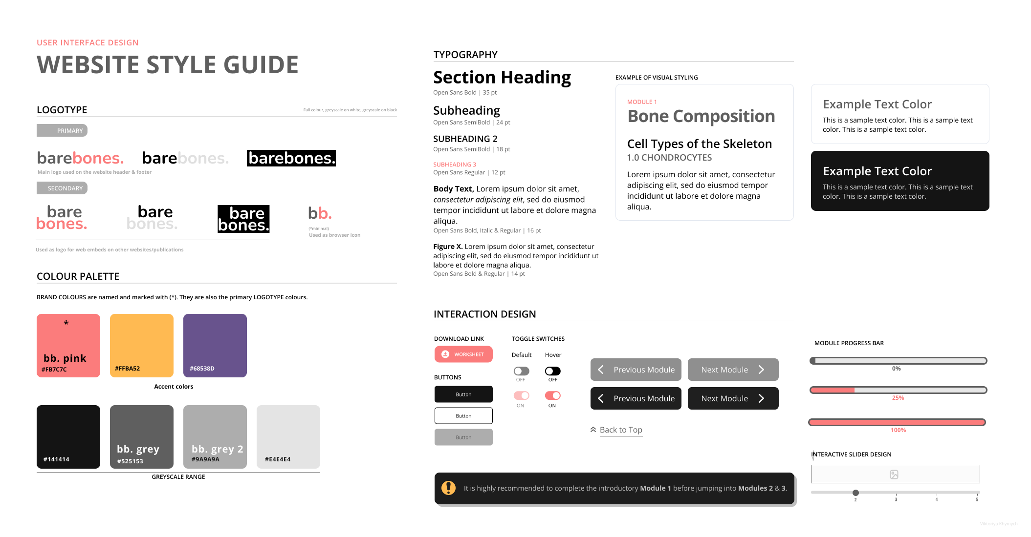
I wanted the interface to feel simple, clean and inviting, without distracting or flashy elements. I opted for minimal color with subtle gradients and rounded edges in various UI elements to keep the focus on full-color sliders that would be implemented during development.
STYLE GUIDE


PROCESS WORK
PRODUCTION
PHASE IV
DEVELOPMENT.

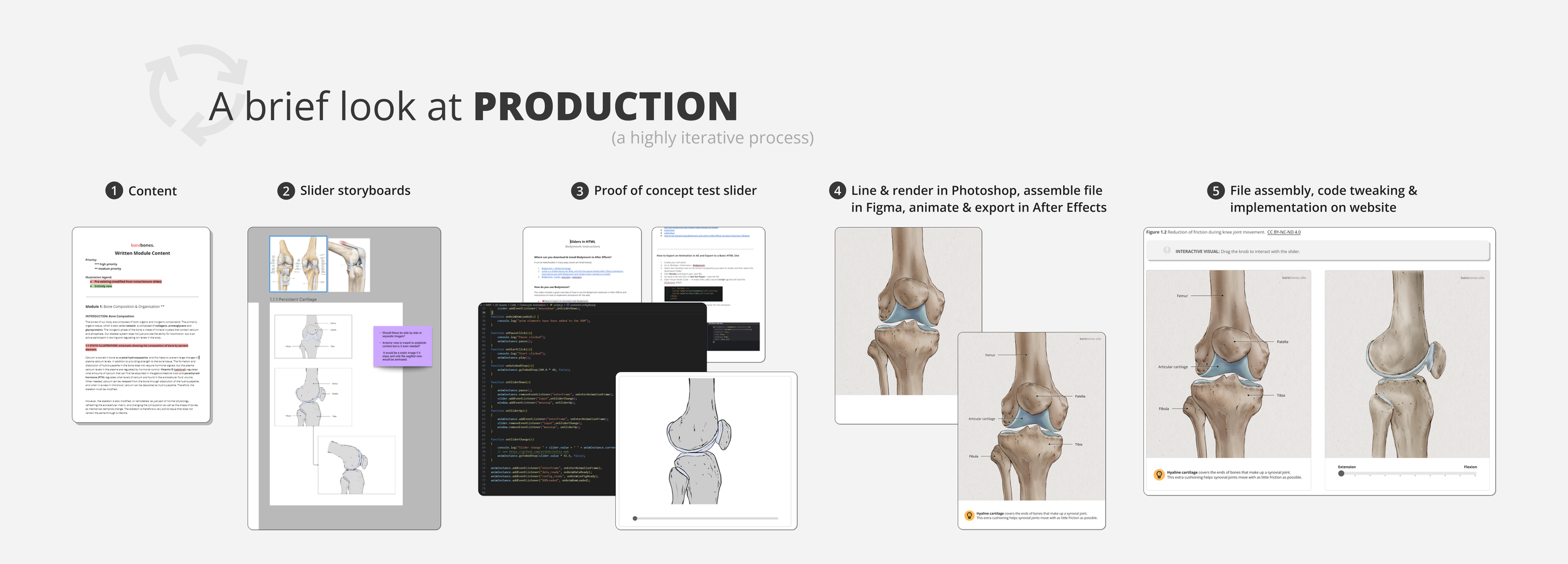
Below is an example of a physiological process captured by a slider displayed on the barebones. website. After all of the steps were illustrated and assembled in Figma, I animated each component separately in After Effects and coded the slider using JS/HTML. The visual appearance of the slider on the website was standardized and refined through code as well. File & asset management were extremely important here as I needed to make changes quickly without having to re-render my animations or reassemble any files from scratch.
ASSET PRODUCTION

Many of the assets, including the ones below, were created entirely in Illustrator. Vector files are much easier to work with when it comes to Lottie animations.
MISC ASSETs PROCESS
I used an After Effects plugin called Bodymovin to translate animations based around shape layers in combination with Lottie libraries. This is accomplished through the use of the JSON file format, which is what stores the information for the animation.
Bodymovin does not support every single function in After Effects, so I had to be strategic with how I handled my assets when it comes to where they were created and assembled, especially when it comes to grouping elements. For this reason, many of my assets were created in Illustrator as vector assets.
I used the Overlord plugin to easily move assets between Adobe programs. This was incredibly useful as the visual style of barebones. incorporates a lot of gradients, which do not transfer well between programs without Overlord.
CODING SliDERS
Each asset followed a specific folder structure.
Example slider code.
